The Surprise of Dali

There are some works of art and artists, which, because they are so well known, somehow seem to loose their impact on one’s retina.

Such was the case with Dali for me. Of course, I was aware of his role in Surrealism and I was familiar with his attention-directing character. Yet, recently, a limited edition photolithography we acquired (Soft Watches, Half Asleep from Les Diners de Gala, 1971) mysteriously caught my attention and led me to revisit my opinion. Beyond the caricature (there is more to the Lanvin chocolate commercial than what meets the eyes), I discovered a mesmerising body of work which can, for instance, creates a prolific dialogue between Freud and Velazquez or explores in philosophical terms the very parameters of space and time (remember the melted clocks).

His gargantuesque power to hop from one medium to the other, to reinvent himself without being trapped by any art movement and to eventually turned himself into a work of art, simultaneously absorbed and ridiculed so many of the tactics of his contemporaries and artists to come.

He might not be the most popular these days, and this is partly due, I think, to his unforgiving capacity to confronts us with what we don’t want to see…the meanders of our unconscious. In these days of confusion, we could all learn from Dali’s observations and take a deep look into the objects within our minds or within our world that we cannot photoshop…

Salvador Dali, detail from the panel of the Wind Palace ceiling (1972-1973)

Salvador Dali, detail from the panel of the Wind Palace ceiling (1972-1973)

Salvador Dali, Soft Watches Half Asleep, photolithograph 1971

Salvador Dali, Soft Watches Half Asleep, photolithograph 1971

When She Draws

Two hands, speckled with autumn leaves, lay on each side of a large sheet of white paper. In her left hand, between her knotted fingers, Greta holds a large black marker. With confidence, determination, she stamps the sheet of paper and begins to draw sharp, definitive shapes.

So was my introduction to the practice of Greta Bratescu in a video exhibited at the Hauser & Wirth gallery, which recorded the act of drawing by the Romanian artist.

IMG_1533.jpg

The exhibition, entitled The Power of the Line, surveys the work of Bratescu over the last decade and focuses on the line as a structuring principle. In her hands, drawing appears as a performance, as the spatial trace of a movement that happened in the making of a work of art. To me, the precept of the work lies, among other things, in the will to capture the energy, the mood with which a posture or a gesture is executed.

The artist states that she doesn’t know where the line will lead her, but as I look at her compositions, I understand that it is fully intended. She incorporates serendipity into the work like a dance a partner with whom she collaborates in order to achieve a more dynamic, more engaging, occupation of space.

What strikes me with Greta Bratescu, is her effortless ability to succinctly bridges the gulf between drawing and dance, between topology and picture. As she beautifully puts it, in the interview on display in the gallery, drawing is like singing. Here with one verb, Greta summerises what she hits with one line, i.e. the depicting of a highly constructed, cultural and yet, at the same time primal, existential gesture.

IMG_1532.jpg
IMG_1534.jpg

The Only Way to Cross

To say that I was waiting with trepidation for this exhibition is probably an understatement. To me, there are two major reasons which make this show all the more exciting. First, I don’t seem to remember any exhibition on ocean liners which focused on their designs. More often than not, ocean liners are discussed in maritime or sociological terms. The second reason which makes this exhibition exceptional is the range, and the quality, of the large selection (more than 200) of pieces on display, some seen for the first time in Europe, such as a wood carved panel from the Titanic first class lounge. Other wonders include: a monumental lacquered panel by Jean Dunand for Normandie’s first class smoking lounge, some furniture from the Queen Mary’s long gallery, the wardrobe of Miss Emily Grigsby…

The exhibition, curated by Ghislaine Wood and Daniel Finamore, explores in a really engaging and immersive manner - thanks to the clever scenography - a 100 years of traveling by sea, when crossing the Atlantic by sea was the only way to cross (to echo the title of a seminal book on the subject written by the brilliant John Maxtone-Graham).

Rather than being chronological, the show is thematic and first looks at the promotion of liners then at the politics of style to ends with the idea of the liner as a machine. Here, is a very personal take on some of the objects exhibited which I was really keen to contemplate. I’m adding some information and visuals which show the objects in their original contexts.

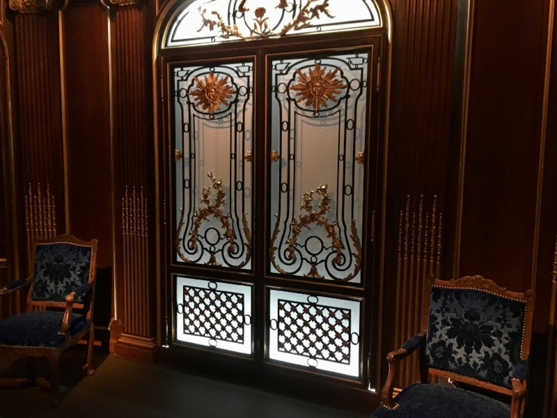
I was particularly looking forward to seeing those oak panels from the communication gallery of the France of 1912. The doors come from the embarkation hall of the same liner. As throughout the ship, references to the Sun King are dotted around, as here on the upper part of the doors , and blended with the Louis XVI background. The ensemble was executed by the Ateliers Georges Remon in Paris. The two armchairs come from the first class dining room of the France. The exhibition uses many visual tricks to contextualise the pieces exhibited.

IMG_6124.jpg
IMG_6125.jpg

A panel from the large glass mural ‘L’Enlevement D’Europe’ designed by Jean Dupas and executed by Jacques-Charles Champigneulle for the first class Grand Salon of Normandie (1934). The process behind such glass panels was called ‘verre eglomise’. The term was coined after an 18th century restorer of glass-panelled picture frames called Jean-Baptiste Glomy. Rather than drawing his design on a canvas, Dupas sketched it directly on the reverse of glass panels which were then assembled into a mosaic. The difficulty of the eglomised glass process lays in the fact that images are painted and then covered with silver, gold and palladium leaves in reverse so that highlights are done first and background colours last. The panel is only one of the hundreds (as shown with the red rectangle in the second photograph) that were adorning the main lounge where 4 large murals were created, covering a total surface of more than 400 meters square.

Untitled 2.png
Screen Shot 2018-05-01 at 21.25.24.png

An absolutely breathtaking lacquer panel by Jean Dunand which was adorning one of the walls of Normandie’s first class smoking lounge on Promenade Deck (1935). The set of 4 panels that Dunand created for this space had for overarching theme: ‘Man’s Games and Pleasures’. This one is tilted ‘Les Sports’ and represents characters ‘a l’égyptienne’ for they are represented sideways. The other panels were titled ‘fishing’, ‘horse taming’ and ‘wine harvest’. Dunand used a Sugarawa formula (a blend of plaster, gesso and clay) which prevented wood from warping if only one side is lacquered. Dunand, with the help of his son, would carve the images and then up to 30 layers of lacquer were covering the surface of the panel. To prevent any crackling or shrinking the studio was kept moist which extended the drying process to up to 3 days. Between each layer of lacquer the surface was polished to a mirror finish. After the last layer was applied, the surface was covered with gold leaves before being polished with charcoal powder.

Screen Shot 2018-05-01 at 21.26.57.png
Maria Riva, Marlene Dietrich’s daughter, remembers traveling on the Normandie as a child. As she explored the ship by herself one day, Maria finds herself in the First Class smoking lounge with its ‘raisin-suede chairs’ and described Jean Dunand’s l…

Maria Riva, Marlene Dietrich’s daughter, remembers traveling on the Normandie as a child. As she explored the ship by herself one day, Maria finds herself in the First Class smoking lounge with its ‘raisin-suede chairs’ and described Jean Dunand’s lacquers as ‘murals depicting the life of ancient Egypt that would have made Tutankhamen envious’. A photograph of Normandie’s First Class Smoking lounge on Promenade deck coming from a 1935 French Line brochure. If the adjacent Grand Lounge had a cross plan, the Smoking room followed a T shape and was 2 decks high (against the 2,5 decks height of the Main Lounge). Like all the public rooms of Promenade Deck, it was under the supervision of architects Roger-Henri Expert and Richard Bouwens van der Boijen. This room had an almost pharaonic feel with its gold lacquered walls, and 4 large lacquered murals by Jean Dunand. On this occasion, Dunand created a series of everyday life scenes (hunting, fishing, sports and harvesting) in an Ancient history spirit. The dark maroons, greens and reds of the murals were complimented by the dark prune and Havana colours of the leather armchairs. The mural ‘Les sports’ by Jean Dunand is normally on permanent display at the Musee d’Art Moderne de la Ville de Paris.

Two of the twelve bronze gilded tiles placed on the back of the 6 meters high double doors of the first class dining room of Normandie. The second photograph, taken while the ship was still being furnished, shows those pieces in context.

Screenshot-2018-5-1 Ocean Liner Design History on Instagram “Wonders I discovered thanks to the #oceanliners exhibition vam[...].png
Screen Shot 2018-05-01 at 21.25.49.png
A colour photograph of Normandie's first class dining room. Normandie’s monumental First Class dining room on C Deck. Capable of welcoming all first class passengers in one sitting (more than 700 guests), this space rose on three decks, occupying a …

A colour photograph of Normandie's first class dining room. Normandie’s monumental First Class dining room on C Deck. Capable of welcoming all first class passengers in one sitting (more than 700 guests), this space rose on three decks, occupying a vast volume inside the hull. In order to achieve such an architectural prowess many webbed towers had to be built within the side bulkheads in order to avoid any columns. The publicity department of the French Line never missed an opportunity to stress that this 93.3 meters long (305 feet ) room was longer than the Hall of Mirrors at Versailles. The allusion to Versailles was all the more relevant than here too glass was the main material. With a width of 14 meters (46 feet), the room also provided private dining rooms on each side. Architects Pierre Patout and Henri Pacon used 720 square meters of glass some of which were hammered. The lozenge pattern of the glass slabs was created by August Labouret, who tinted the back of each one in amber. Mounted on a mirrored walls with light within, the result was an ethereal and warm light. The incandescent bulbs hidden in the gold coffered ceiling also played an important part in achieving this effect. Lalique designed the 38 4,87 meters high light fixtures placed at regular interval on the walls. The two large chandeliers (5 tons each) placed at each ends of the room were also signed by Lalique. But perhaps the most iconic Lalique design in the room was the 12 pots a feu that writer Colette described as icebergs on the maiden voyage. In 1936, judged to cumbersome for service, 6 of the pots a feu were removed, as it is visible on this 1937 colour photograph. Patout drew a rubber carpet with navy, black and purple squares delineated with fine white lines. The only problem with this rubber carpet is that it wasn’t absorbing any sounds and paired with the onyx and glass cladding of the walls, the dining room was actually very noisy. Patout also designed the dark mahogany chairs with Ruhlmann-esque legs. The gild-lacquered statue, by sculptor Dejean, at the back was titled Peace.

When I think of the history of style in furniture, I often think back of a gallery of chairs at the Musee de Arts Decoratifs in Paris which chronicles the evolution of styles by focusing on one item of furniture: the chair. The series of chairs exhibited in 'Ocean Liners, Speed & Style' reminds of the curatorial set up in Paris and tells the story of the different designs from pretty much the same period but from different countries.

A mahogany and velvet chair from the first class Grand Salon of the Ile de France (1927). I’ve seen this chair in photographs many times but it’s only after seeing it in the flesh that I fully appreciate how vibrant its colours are. Designed by Louis Sue and Andre Mare - and made by Henri Nelson with an Aubusson upholstery - this would have been a flamboyant piece in the gold and dark red lacquers, of the lounge. It is all the more remarkable to be able to admire it today than the upholstery of the furniture of the Ile de France’s lounge was replaced by a lighter and sober textile in 1934.

IMG_6138.jpg
The original 1927 decoration created by Sue and Mare for the first class main lounge of the Ile de France (the design scheme was modified in 1934 to fit the new motto of the company ‘air, light, space... gaiety’). The room, decorated with scarlet co…

The original 1927 decoration created by Sue and Mare for the first class main lounge of the Ile de France (the design scheme was modified in 1934 to fit the new motto of the company ‘air, light, space... gaiety’). The room, decorated with scarlet columns and a gold coffer ceiling was an extension of the precepts showcased in the 1925 exhibition.

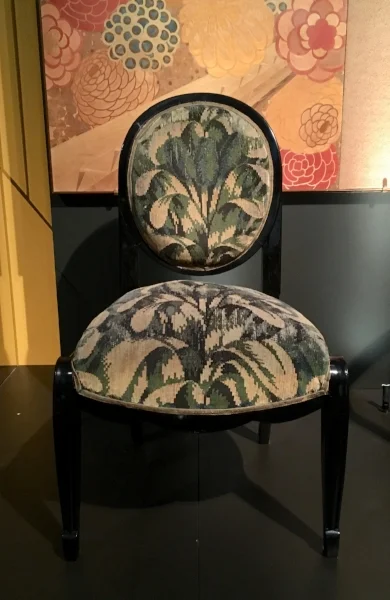
A sycamore chair from the first class dining room of the Ile de France designed by Pierre Patout (1927). The chair was made by the house Neveu and the upholstery was by Brunet-Meunie. Here, the textile is a modern exact reproduction of the original design. Looking at this wonder, I was astounded by the boldness of the design which, almost a century later, I find to be just as striking.

Screen Shot 2018-05-01 at 21.26.37.png
Screen Shot 2018-05-01 at 21.26.45.png

An adorable chair coming from the first class children’s playroom of Normandie decorated by architect Marc Simon. Illustrator Jacqueline Duché was commissioned to paint the mural (circa 1934). The children playroom was located on Sun Deck at the foot of the third funnel - which was a dummy - hence the arched wall.

Screenshot-2018-5-1 Ocean Liner Design History on Instagram “An adorable chair coming from the First Class children’s playr[...].jpg
Screen Shot 2018-05-01 at 22.22.25.png

It took many talents to create the flowery sumptuousness of this side chair from the first class grand salon of Normandie: the chair itself in gilded wood was designed by Jean-Marie Rothschild and made by Baptistin Spade and Georges Lebrun. As for the upholstery in wool and silk tapestry, it was designed by Emile Gaudissard and executed by Maurice Laure in the Aubusson Manufacture.

Untitled.png
The red, gold, coral, pearl grey harmony of the first class Lounge of the SS Normandie magnified by the églomise glass murals of Jean Dupas conceived around the history of navigation. This colour photograph from 1937 provides an incredible glimpse i…

The red, gold, coral, pearl grey harmony of the first class Lounge of the SS Normandie magnified by the églomise glass murals of Jean Dupas conceived around the history of navigation. This colour photograph from 1937 provides an incredible glimpse into the sumptuous space created by Roger-Henri Expert and Richard Bouwens van der Boijen on Promenade Deck. The photograph is taken looking aft towards the smoking lounge which leads to the Grill Room. M. Gaudissard designed the flower patterns found on the Aubusson upholstery and on the giant rug.

All these artifacts are part of a scenography which takes the visitor onboard to a crossing. The most spectacular effect created for the exhibition is probably the 'Grande Descente' or, in other words, the impressive staircase that was leading passengers to the dinning room and where they could make an entrance in style. The purpose of these staircases (always mandatory on French liners) were part of the theatrics accompanying the ritual of dinner, where passengers were at the same time actors and observers. The narrative of the exhibition culminates in the sun deck setting where visitors found themselves on deck, spotting liners passing by on the horizon, while contemplating a starry sky around the outdoor swimming pool. An atmosphere arises from the displays which made me reflect on the nature of time during a four day crossing where one is forced, so to speak, to befriend impatience while being part of the self-contained world (with its own customs, traditions, and culture -for reference John Maxtone-Graham remarks, for instance, that first class passengers were never lock their cabins, a notion that is just unfathomable for a contemporary traveller) that an ocean liner was. Ultimately, the interior design of ocean liners was intrinsically linked to a bygone art de vivre  which disappeared with WWII. 

5 Seconds Later

What you see is not what you think it is.

Cinq Secondes Plus Tard, Julien Berthier, 2017.

Cinq Secondes Plus Tard, Julien Berthier, 2017.

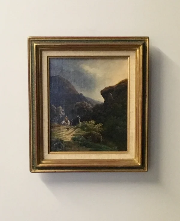
This painting, exhibited recently at Le Portique (Le Havre's centre for contemporary art) is actually part of a work by contemporary artist Julien Berthier titled Cinq Secondes Plus Tard, 2017, (Five Seconds Later) which could be described as an attempt to inscribe the passing of time into the medium of paint. The artist acquired some 19th century landscape paintings and commissioned a restorer to alter them in such a way that they capture the scene represented 5 seconds later. The restorer drifted clouds along, extended shadows and modified the positions of characters.

Cinq Secondes Plus Tard, Julien Berthier, 2017.

Cinq Secondes Plus Tard, Julien Berthier, 2017.

The piece is conceptual in as much as the viewer cannot detect the alterations that were painted over the original scenes. It is also conceptual for Berthier is giving instructions to perform the work and as such his hand doesn't execute the work. Willingly, the artist distances himself from the image produced and offers the beginning of a discussion about authorship. As an idea, it is quite poetic to fast forward a scene that took place,or was represented, 150 years ago. Berthier starts a direct dialogue with the past, which is compressed in the object of the painting. This, in addition to the physical act of painting embedded in Five Seconds Later, opens up philosophical discussions about the nature of time. And it seems as if, Berthier starts this discussion with his own instruction-based approach as a way of finding the temporality suited for his own practice.

Cinq Secondes Plus Tard, Julien Berthier, 2017.

Cinq Secondes Plus Tard, Julien Berthier, 2017.

North Sketch Sequence

I applaud the incentive behind such an abstract form of portraiture: North Sketch Sequence at Chatsworth by artist Jacob van der Beugel. Faithful to their taste and understanding of contemporary art, the 12th Duke and Duchess of Devonshire commissioned Jacob van der Beugel (a pupil of Edmund de Vaal) to create a family portrait. For this site-specific piece, the DNA of the Duke and Duchess, as well as their son Lord Burlington and his wife Lady Burlington, was visually translated into hand-made ceramic straw-coloured tiles (the straw colour is the Cavendish’s racing colour).

Detail of North Sketch Sequence, 2014

Detail of North Sketch Sequence, 2014

Each tile is composed of four rows of blocks, varying in size and texture, that represent the four nitrogen containing bases which are making the double helix of a DNA sequence. The glazed blocks are arranging according to each individual’s response to a subject. The Duke chose his favourite walk in the garden, the Duchess her favourite piece of music, Lord Burlington wanted to be surrounded by his family and Lady Burlington chose a stitching pattern. The fifth portrait, titled the Everyman portrait, materialises the DNA we all share and metaphorically draws a portrait of us all. This almost participatory work, replaces, in places, ceramic blocks by little mirrors which conceptually let the viewer takes part in the piece. On the other side of the corridor, the wall covered with mirrors built in hand-made-ceramic tiles, reflects not only the portraits of four members of the Cavendish family, but it also incorporates the viewer into the artwork creating a collective portrait. I find the piece to be successful in linking past and present, in uniting the tradition of family portraiture with conceptual contemporary art, in such a seamless fashion with its Baroque surroundings. By highlighting what makes us human, the piece invites to viewer to go a step further than contemplating the heritage of the Cavendish family, it not only provides a relatable artwork, but is also made me like the Cavendish’s open-mindedness and intelligence even more.

North Sketch Gallery at Chatsworth House

North Sketch Gallery at Chatsworth House

The mirrored wall of the North Sketch Gallery

The mirrored wall of the North Sketch Gallery

Y Lle Celf

A couple of weeks ago, I visited the Eisteddfod festival for the second time. Amid all the wondrous cultural artefacts presented I was once again very impressed by the Visual Art Pavillion called Y Lle Celf, in Welsh. Among all the works selected, here are the few which caught my eye.


André Stitt's two large abstract paintings offer an exploration of architecture, of rather an empirical expression of architectural space. In other words, the artist provides an evocation of what it feels like to be standing in a building. What strikes me with Stitt’s works is how successful his pieces are in translating what is inherently a 3D experience into a 2D format. Yet, he chooses the medium of painting, and thus creates a interesting dialogue between architecture and painting, Cofeb I and II (Monument I and II) have a canny ability to play with my eyes and to convey a sense of illusion close to an holographic effect. The layering of brush strokes manages to communicate a sense of depth and renders visible the sensations of space from multiple points of view. I was particularly seduced by the density of his cream brush strokes. Each varies in transparency and diffuses light differently, like blocks of quartz piled on each other.

André Stitt, Monument I

André Stitt, Monument I

André Stitt, Monument II

André Stitt, Monument II

Another series of paintings which also captured my attention were by Lara Davies who exhibited works which, simultaneously, record and expand her experience of reading exhibition catalogues. The books she paints are represented as seen through her eyes, open on her lap. What I find noticible is the way the paintings not only witness the influence of artists - in this case such as Hockney and Doig - on Davies and other artists, but also how they borrow the codes of documentary photography to investigate this moment of contemplation which is part of the process of making work.

Laura Davies, Me Reading 'Peter Doig' In My Studio, 2017, oil on canvas, 40x30cm

Laura Davies, Me Reading 'Peter Doig' In My Studio, 2017, oil on canvas, 40x30cm

Artist Stephen West presented a set of four large charcoal drawings titled Ceffyl Jacques (Jacques' Horse). The piece was inspired by the view from his studio in France. Executed over several years, the large drawings reflect on the passing of time and invoke mutltiple scenes of his wife weeding. Ceffyl Jacques with its screen-like format also delicately echoes the tradition of Chinese landscapes.

Stephen West, Ceffyl Jacques, 2016, 300x150x40 cm - Drawing, Charcoal - Paper

Stephen West, Ceffyl Jacques, 2016, 300x150x40 cm - Drawing, Charcoal - Paper

A room of the pavilion was dedicated to the installations of Cecile Johnson Soliz, where the artist uses the medium of paper to create large sculptures which bear the traces of manipulations, such as twisting, tearing, creasing or wrinkling. Those gestures are then blown up to monumental size and become a way of magnifying the artist’s hand in her research process. I am responding to how focus the works are in their study of a single material. To ignite a conversation with the paper materiality of the sculptures exhibited, Soliz also employs papers which are drawn by a thick black line. This line, not only works as a visual guide to observe the details and composition of some of her sculptures, but it also introduces the idea of converting a 2D line into the 3D physical space of the gallery. All in all, the curators of the Y Lle Celf have yet again delivered a rich selection of artworks and the intrigue, stimulation and inspiration are still intact I as write these lines.

Cecile Johnson Soliz, Drawing

Cecile Johnson Soliz, Drawing

Cecile Johnson Soliz, Drawing (wound-round)

Cecile Johnson Soliz, Drawing (wound-round)

Death by Water

Dellasposa gallery’s latest exhibition Ars Moriendi revolves around ideas of time passing and mortality. The title of the show is derived from a 15th century Latin text which advises on the art of ‘dying well’. Following this curatorial framework, the exhibition brings together three artists working in different medium: Gail Holding (sculpture), Alexander James (photography) and Darren Coffield (painting).

Alexander James, Vanitas, 2012. Entire portfolio comprising six Giclee prints on Hahnemuhle fine art pearl 285 gsm paper.

Alexander James, Vanitas, 2012. Entire portfolio comprising six Giclee prints on Hahnemuhle fine art pearl 285 gsm paper.

As I’m walking through the gallery, I discover that Gail Olding’s piece Each Day (2016), a poetic site specific installation made of coffee spoons which materialise the passing of time, is inspired by T.S. Eliot’s lines from his poem The Love Song of J. Alfred Prufrock
        For I have known them all already, known them all:
        Have known the evenings, mornings, afternoons,
        I have measured out my life with coffee spoons;
        I know the voices dying with a dying fall
        Beneath the music from a farther room.
                So how should I presume?
In Each Day, it is death coming towards us that is referred to. The spoons, as metaphors of the passing of time day by day in a domestic and intimate context, brings us closer to our ultimate fate. The uniqueness of Gail Olding’s Each Day lies in its formidable ability to be a receptacle of multiple temporalities to be reinterpreted in one moment each time the viewer is encountering the installation in the gallery space.
Interestingly, the works present in the gallery, as well as the theme of the exhibition, reminds me of another of T. S. Eliot’s masterpiece The Waste Land (1922); which opens with ‘The Burial of the Dead’. Then, another of his poems also comes to mind titled Death by Water which also seems to resonate with the intertwined themes of death and water running through Art Moriendi. In Death by Water the author depicts a shipwreck with all its debris bobbing on sea waves. As such, Eliot’s poetry in connection to both Alexander James and Gail Olding’s practice, draws my attention to the very materiality of their works, not only the wonderful meticulous and painstaking details of their pieces, but also the ways in which the objects are embodying the staging of an encounter to-be; as if they are waiting for the viewer to take part.

Gail Olding, Each Day, 2016, Stainless Steal.

Gail Olding, Each Day, 2016, Stainless Steal.

Death is perceivable in different ways throughout the show, first there’s the tradition of the vanitas which is explored by Alexandre James. Vanitas which comes from the latin vanus and which means ‘empty’ acts as a reminder of our own mortality, of the fragility and beauty of life, traditionally illustrated by skull and/or flowers. More specifically here, it might also point at the death of the artist and her/his attempt to transcend her/his own mortality with art. It is worth pointing out that Alexander James very much anticipates the becoming of his work beyond his own life and prepares his own legacy by archiving and documenting his practice extensively. His photographs also seem to investigate the mortality of his medium (i.e. 1930s analogue photography) by transcending it with the reflecting qualities of water. Somehow, he is challenging the cultural and economical pressures that qualifies a medium as dead. The tour de force of his approach is to use the reverberating and transparent quality of light, which frames and beautifies the props photographed, rather than a blinding white light that saturates the lens. To me, the drowning of objects in Vanitas (2012) is paradoxically generative of images. The death of the props gives birth to the work of art. One is witnessing a process of metamorphosis where water is simultaneously death and life. Thus, water is not only contradictory but it is also essentially transient. In L’eau et Les Reves (Water and Dreams, 1942) French philosopher Bachelard explains that one never swims in the same water, that swimming is always a discovery, a form of christening always anew. Yet, the act of photographing suspends the transient quality of water to reveal its materiality. The materiality of water is, according to Bachelard, what enables the dream to happen. Indeed, he explains that in order to dream one has to dream through matter rather than objects. It is as if, Alexander James in Resting in a Bed of Dreams (2012) is illustrating that point, he immerses his work into the physiological qualities of water in order to open up an oneiric experience for the viewer.
Vanitas also acts as a plea for humility in the face of the transcendence. Interestingly, Bachelard reminds us that inherently water can be associated with pride as the myth of Narcissus illustrates it. Consequently, there’s a duality of water, at the same time transparent, and even comparable to a lens in James’ pieces, it is also a mirror in which one is absorbs by her/his own image. In James’ work water could be thought of as a mirror reflecting the history of art, from the Old Master to the Pre-Raphaelites, that the artist is referring to. The nexus of death and time can also be synonymous with a pause in the creative process. For instance, it is worth noticing that the term ‘dead water’ is a technical nautical term that describes two layers of water of different salt densities which forces a ship to slow down. This physical phenomenon evokes to me the idea of being caught by your own medium and to somehow never being able to tame it. In other words, it seems to imply being in resistance with your medium. In Alexander James’ work, the act of photography suspends the passing of time inherent in the substance of water and as such begins an engagement with the medium of water that takes the form of an intervention.

In Gail Olding’s sculptures death is palpable in a different manner. Razzle Dazzle, a large golden bullet which denounces the glamorisation of war found in literature and more specifically in religious texts, embodies death to be; it is the threat of death that is deployed before our eyes. Razzle Dazzle is a powerful and mysterious object, it radiates its enigmatic yet provocative presence to the space. It could be red as a totem, in as much as, it is a piece that conveys different meanings coming from different groups all part of the same society. Indeed, the term also refers to the cubist-inspired camouflage paint that war ships were using during WWII. Simultaneously phallic and synonymous of an advanced medical remedy, golden bullet also promises to offer an effective solution to a previously unsolvable problem. Like a totem on which aspirations and identities are projected on, fragments of significance are thrown onto the smooth surface of the bullet, creating a conceptual artefact which, at the same time, belongs to contemporary culture and yet keeps its elusiveness by refusing to be labeled in one way or another.

If in Alexander James’ Vanitas the objects are a mean to set up a visual narrative in which objects are vehicles of an attempt to reach the transcendence, to touch upon the metaphysical, whereas in Coffield’s painting the objects are a mean of expressing what the world means to him. This is where the heritage of 18th century French painter Chardin is the most perceivable. In a recent programme The Art of France, Art Historian Andrew Graham Dixon explains that Diderot celebrated Chardin for his ability to convey, for instance in the painting The Skate (1728), emotions and ideas closer to a simpler life and therefore closer to truth. Whereas, Diderot condemns Boucher for representing the decadent life of the ruling class. The philosopher is turning art criticism into social criticism where the value of the work of art is connected to its capacity to nurture a connection with truth or not. Following up Diderot’s analysis, Graham Dixon see in Chardin a very political and revolutionary work.


If the artists curated here are influenced by literature - Hamlet for Alexander James, T.S.
Eliot for Gail Olding and Marcel Proust for Darren Coffield -  the relationship between text and image manifests itself in very different ways in each practice. If Alexander James is embracing the language and codes of the vanitas and its presence in art history, Darren Coffield is re-intepretating the language of the nature morte and the heritage of Chardin and Cezanne, Gail Olding’s practice stands out in that both Each Day and Razzle Dazzle are operating outside the field of languages and distribute instead, in the gallery space, a few signs flexible enough in their conceptual architectures to allow us the appropriate them and to truly engage in a conversation with the artist.

Gail Olding, Razzle Dazzle, 2016, Wood Acrylic Gold Leaf Paint.

Gail Olding, Razzle Dazzle, 2016, Wood Acrylic Gold Leaf Paint.

Wordly Pleasures

Hungarian artist Mate Orr presents until 10th June his first UK-solo exhibition entitled Masks, Mysteries & Other Worldly Pleasures at the Fairhurst Gallery in Norwich.

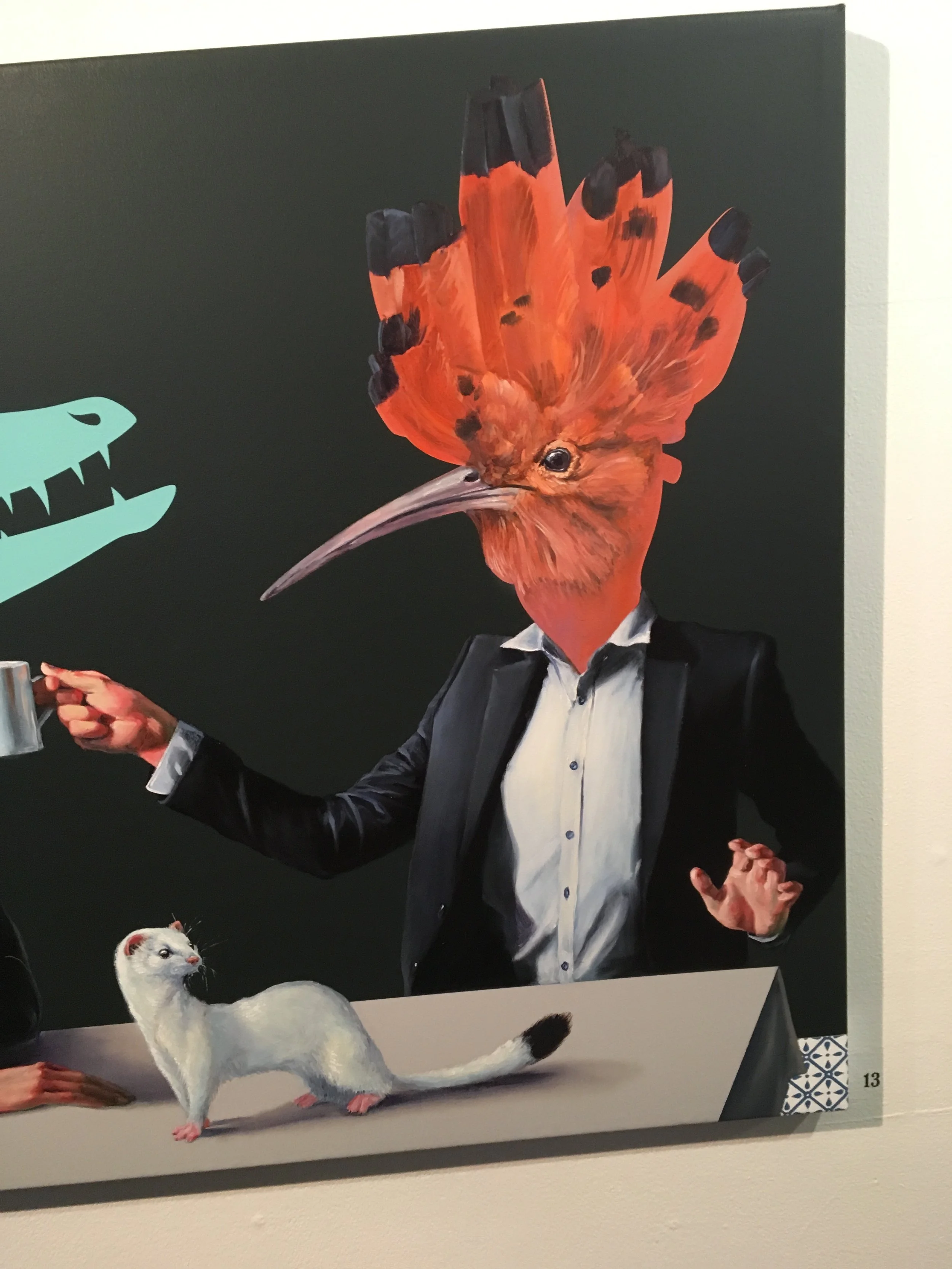
Mate Orr, Dinner, 100x140cm oil and acrylic on canvas

Mate Orr, Dinner, 100x140cm oil and acrylic on canvas

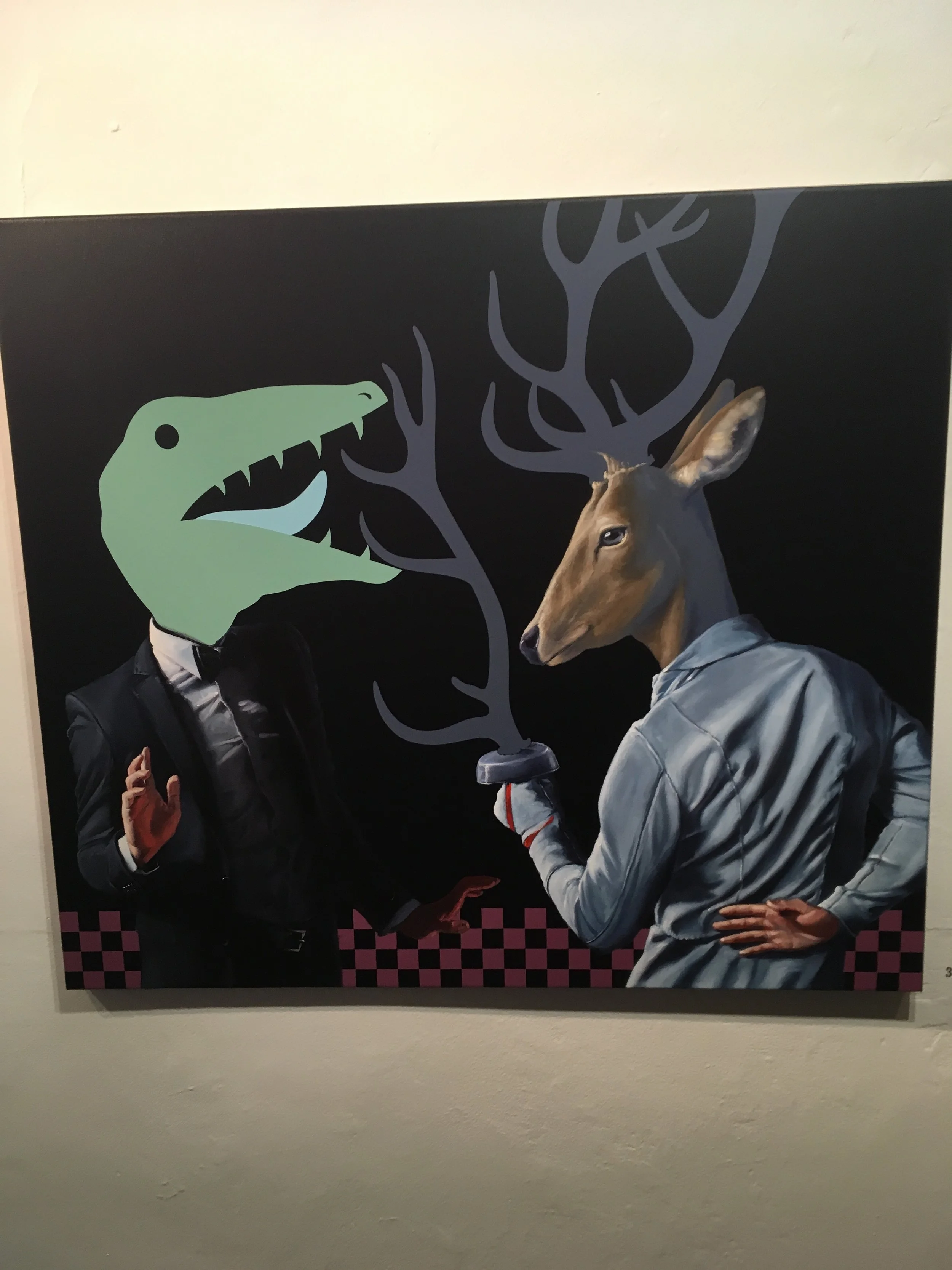
For the occasion, the artist is showing a series of 28 recent works which give the viewer a glimpse into his rich imagination. Indeed, as I walk into the gallery space I encounter oneiric creatures in domestic settings which seem to have been borrowed from Flemish 17th century paintings. There is a certain theatricality in the worlds depicted before my eyes: hybrid man-animal figures that resemble Sobeks (the Egyptian God with a human body and a crocodile head) are next to a fictional coat of arms from an imaginary far away land. Another painting represents a rooster-headed man sharing coffee with a dinosaur-headed character. Further along in the gallery, a half-robin half-human creature debates the reason of his presence in the painting with a hare character, like children contesting the rules of make-belief games. The charm of Mate Orr’s painting lays in its ability to evoke bestiaries from the history of art, from Hieronymous Bosch’s gardens to Rabelais Gargantua’s tale, in a lighthearted fashion which blends together comic strips and medieval imagery. As a result, the paintings exhibited shift the attention from our own mortality and human limitations to a celebration of our own existence. The fantastic animals depicted in the works are an invitation to go beyond our own boundaries and to take part in the comedy of contemporary life. The painter is leading the way by posing himself as a model, as a way of transcending his status of maker to become a character, the ringmaster of his own world. Orr often appears in underwear with either a dinosaur or a deer head and, as such, seems to stage the desirability of his own body. References to popular culture in the logo of a brand or the shape of a dress, anchor the dream into something real, as if the images produced were generated while day dreaming, in a surrealist limbo between consciousness and unconsciousness.

Mate Orr, Stag with Multiple Antlers, 70x80cm oil and acrylic on canvas, 2017

Mate Orr, Stag with Multiple Antlers, 70x80cm oil and acrylic on canvas, 2017

Mate Orr seems to loose himself in his imaginary world and invites us to witness a play where his fantasies, desires and games are staged for the viewer to enjoy. Yet if a form of unconsciousness and even serendipity might guide the artist in the conceptualisation of his images, their executions are not left to chance, as evidenced by his skilled treatment of bright flat colours, which remind me of Japanese estampes. With such a vivid imagination underpinned by solid technical ability I am looking forward to seeing what Mate Orr does next.

Mate Orr, Still life with Orange Peel (detail) 40x80cm oil and acrylic on canvas, 2017

Mate Orr, Still life with Orange Peel (detail) 40x80cm oil and acrylic on canvas, 2017

Mate Orr, The Incident, 60x70cm oil and acrylic on canvas, 2017

Mate Orr, The Incident, 60x70cm oil and acrylic on canvas, 2017

Bit.code

As a researcher, one of the themes I am particularly interested in is the relationship between text/image and the artworks that are exploring the dialogue between the two. Recently, a piece of digital design titled Bit.code I saw a couple of years ago came back to mind. I encountered this work, by German artist Julius Popp, in 2010, in the context of an exhibition held at the V&A called Decode, Digital Design Sensations in partnership with SAP (a German multinational software corporation). Bit.code was commissioned by the museum on this occasion.

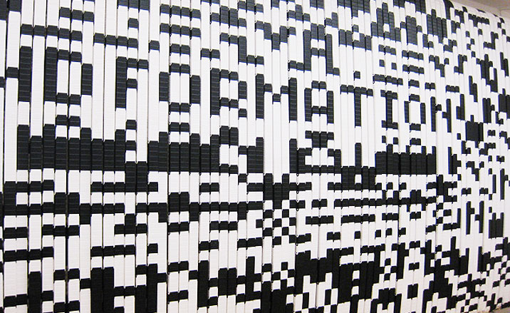
The large-scale installation is made of black and white spinning plastic chains. These plastic chains represent the quantity of data one receives in his/her daily life. SAP provides Popp with softwares allowing him to collect the most used words from news sites and news blogs. The data is then fed into the machine of Bit.code. As the chains spin, they create unreadable images. Yet, at certain points, the plastic chains align and form intelligible words. One of the interesting aspects of the work is not only its capacity to turn words into images, but to do so in real time. Here, the real time factor makes the piece a performative work. As such, Bit.code can be seen as an installation which, alternatively, fabricates and erases itself in a succession of words morphing into images which are then transformed into new words. It also represents, by the fact that it is installed in a gallery space, a threshold between the physical and digital world.
 

Bit.code by Julius Popp, 2010.

Bit.code by Julius Popp, 2010.

What is fascinating to me is the ability of the work to provide a visual representation of the stage where language is not finalised yet. Popp seems to offer an embodiment of the act of translating perceived information, or more precisely data, into a codified and understandable object. In other words, it is a process of clarification that is shown to the viewer. Here, Bit.code gives a glimpse into how digital information - recording according to a binary structure illustrated here with black and white links - is transformed into another language. As such, the work seems to operate on two levels. On the one hand, it can be read, on a phenomenological point of view, as playing with the idea of processing our perceptions of reality before one is able to verbalise them and communicate them. As such, Bit.code highlights the need for a structure in order to grasp the world. On the other hand, it comments on the impossibility of processing all the information generated online. In both cases it is the necessary processes of mediation required to record, structure and share information that are explored.

Yet, according to the artist, Bit.code is more than an illustration, it provides a guide. In an interview with Wallpaper, the German artist refers to the legend in which Ariadne gave a thread to Theseus in order to help him find his way out of the Minotaur’s labyrinth. Popp then describes how for Foucault and Deleuze this thread is broken in the 20th century and how there’s isn’t a single way out today for everything is happening simultaneously. However, with Bit.code, the artist wants to show that an alternative type of orientation is possible in order to navigate the labyrinth of post digital culture. It seems to me that it is precisely in the juxtaposition of technical and epistemological mediations that lies the contribution offered by Popp. Although produced in 2010, to me this contribution still resonate today and is worth considering in order to be able to filter the increasing and overwhelming amount of data available.

Musing Rust

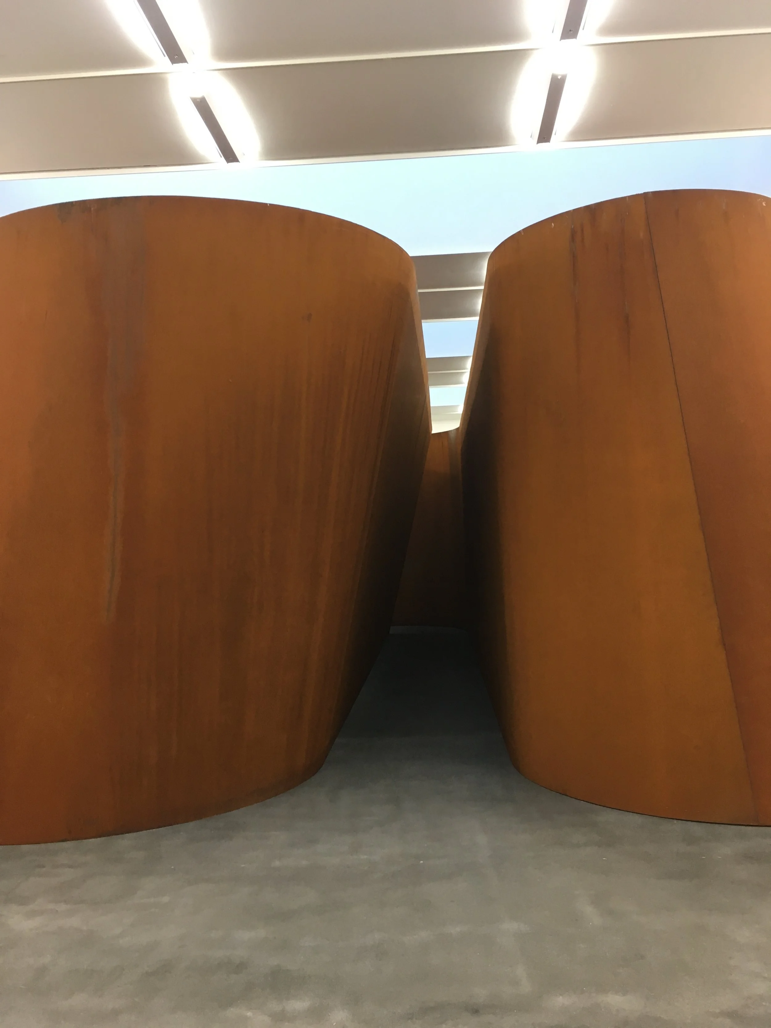
The Gagosian gallery on Britannia Street is exhibiting some of Richard Serra’s recent works. (The gallery is showing the work of the American artist since 1983). The most impressive piece displayed in the show is a colossal sculpture titled NJ-2. The installation, made of two sheets of weatherproof steel, forms a sinuous and abstract construction large enough for the viewer to wander through.

Richard Serra NJ-2 (2016) at the Gagosian, detail of the entry.

Richard Serra NJ-2 (2016) at the Gagosian, detail of the entry.

What strikes me first is the scale of the installation which, not only dwarfs the gallery space, but also invites the visitor to witness the installation from up close. There’s an interesting incongruousness in the display of NJ-2 that contains indoors a piece which seemed to have been designed for outdoors. The structure’s triangular entry, leads to a dark corridor, turns at a corner and directs the viewer to a room that resembles the bowels of a ship. The two sheets of steel, with their thinness and 4 meters height, not only seem to defy any form of equilibrium, but also create a space that is difficult to comprehend completely either from the inside or the outside. As such, whilst meandering inside the steel labyrinth, I am startled by how vast NJ-2 seems. Then, there is the mesmerising rusty colour of the sheets of steel, which is simultaneously absorbed and diffused to offer a luminous velvet texture. The intensity of the colour evens varies as one is walking through the piece. Here, the very materiality of the walls of NJ-2 brings a pictorial quality to the sculpture and turns Serra’s installation into a construction which seems to contain its own set of large-scale abstract paintings. By surrounding the viewer, the rusty colour participates in the immersive dimension of NJ-2 and it appears that Serra’s piece inscribes itself in the historical tradition of ‘immersive’ paintings; one of the most prominent examples being the Water Lilies by Monet (offered by the artist to France at the end of the WWI) where a camaieu of blue provides the viewer with an ‘illusion of an endless whole, of a wave with no horizon and no shore’. Surprisingly, almost as a contrast to NJ-2, the show also exhibits another piece of work entitled Rounds: Equal Weight, Unequal Measure (2016) which consists of three imposing weatherproof steel cylinders.
The capacity of the fiery colour of the steel to captivate my attention brings to my mind what Gaston Bachelard describes in his Psychanalyse du Feu (1938). In his book, the French philosopher emphasises how difficult it is, when one is considering fire through a philosophical lens, not to be seduced by the object studied. There is, according to Bachelard, a primitive imagination of fire that is challenging to overcome if one wants to examine it objectively. Bachelard advocates to embrace this original fascination with fire and to explore it first and foremost in poetic terms. To me, NJ-2 seems to be born out of a similar incentive: the fiery curved walls of the installation, like immobile flames, are hypnotic. Here, Serra appears to let the rusty material speaks for itself in order to offer, on the one hand a musing encounter, and on the other hand a resolute study of space and of the perception of space.


Richards Serra NJ-2 (2016) at the Gagosian, a detail.

Richards Serra NJ-2 (2016) at the Gagosian, a detail.

Richard Serra Rounds: Equal Weight, Unequal Measure (2016), detail.

Richard Serra Rounds: Equal Weight, Unequal Measure (2016), detail.