Exhibition

The Crystal Land

The Crystal Land exhibition at the White Cube brings together works developed between 2008 and 2017 by American artist Josiah McElheny. The titled of the show is borrowed from a Robert Smithson’s essay for Harpers Bazaar published in 1966 in which the artist recalls a visit to the Watchung Mountains with Minimalist artist Donald Judd. The show is divided into three distinct parts, each revolves around a character and aims at exploring the multi-facetted concept of modernism by asking: what alternative historiographies can be imagined?

Josiah McElheny The Crystal Land at the White Cube, a gallery view.

Josiah McElheny The Crystal Land at the White Cube, a gallery view.

The first part of the exhibition is engaged in a dialogue with Simthson’s The Crystal Land essay and refers to works such as, Three Mirror Vortex (1965) or Mirrored Ziggurat (1966). By evoking these mirrored pieces McElheny seems to examine Smithson’s exploration of modernism. More specifically, in the 1960s, with his reflective surfaces installations, Smithson could be seen as extending some of the precepts of cubism; as they can be found for instance in Picasso Table in a Cafe (1912). In this radical painting Picasso provides the viewer with the multiple perspectives of a perceived object on the 2D surface of the canvas. McElheny takes part in Smithson's conversation with cubism by creating structures which translate, in 3D, the multiple broken-down and then re-assembled viewpoints contained in modernism. Interestingly, the connection with modernism is apparent in the way McElheny chooses to describe his work as paintings, which therefore explicitly inscribes his practice in an art historical perspective.
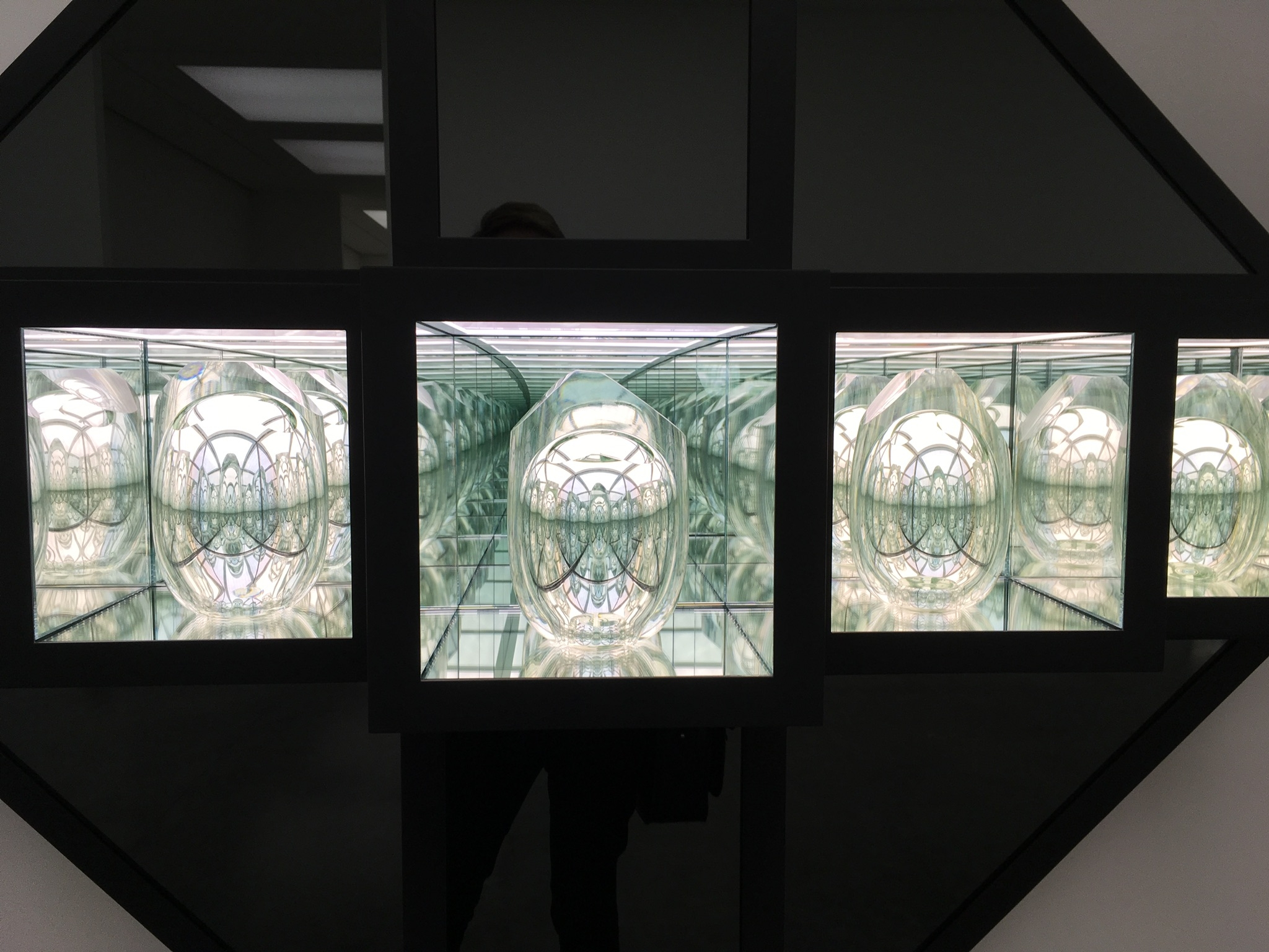
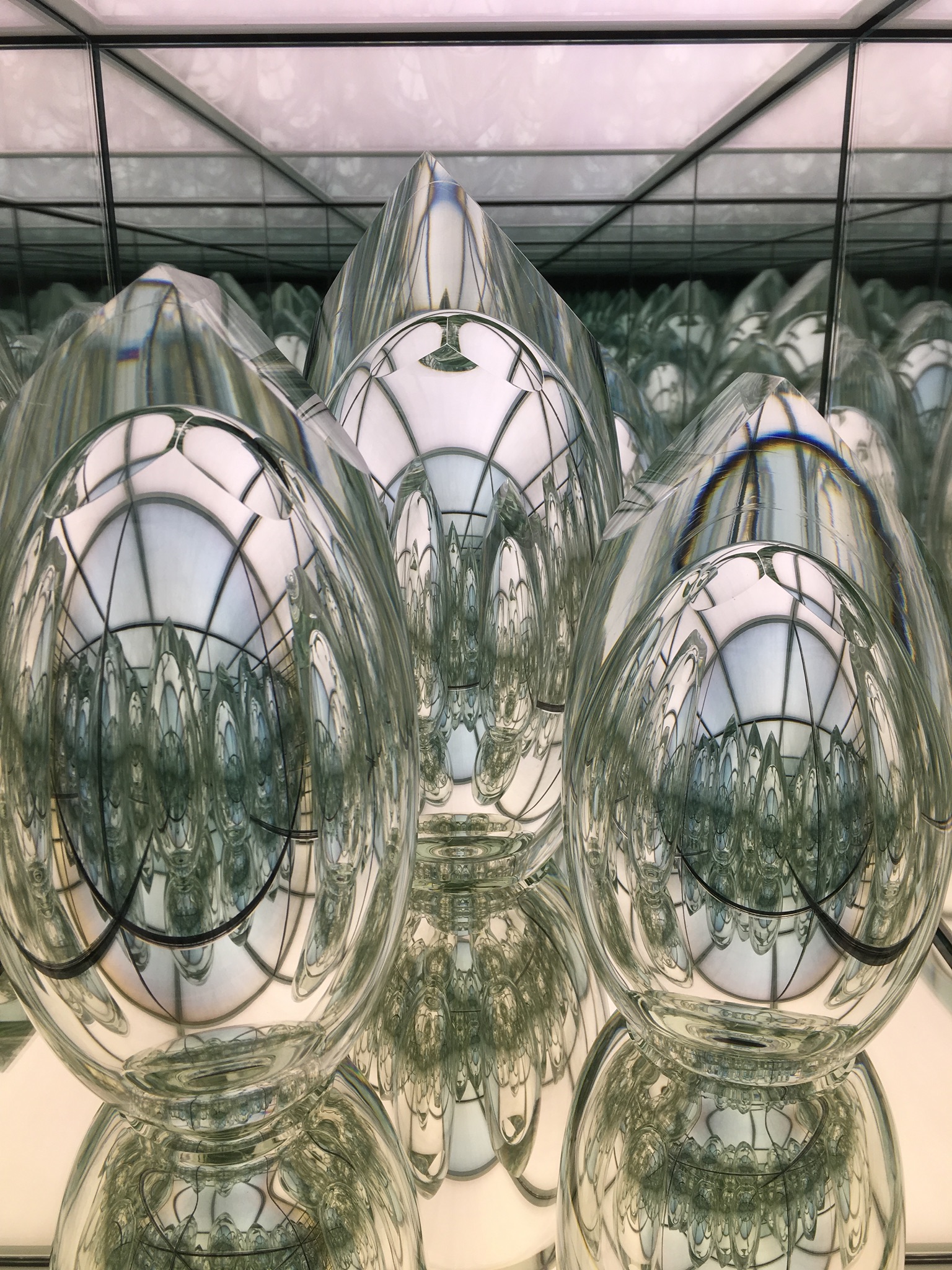
The result is a series of protruding geometric structures comprised of mirrored interior chambers in which are placed hand-blown ovoid glass objects. With their polished surfaces those enigmatic objects distort the structural lines of the box that contains them and generate a series of black and white abstract images. Besides, the contrast between the outer powder-coated steel surfaces of the paintings and their interior mirrored chambers reinforces the optical illusions that de-multiply the glass objects. The fact that McElheny’s pieces seem to erupt from the gallery walls enables the viewer to observe the work from different angles and, somehow, echoes Smithson’s intent to transcribe the multiple perspectives of cubism into a physical experience.

As a result, there seems to be a mise en abîme in the works presented here, not only from a visual point of view (The Crystal Landscape Paintings physically jut out into the gallery space and yet visually offer a recessed perspective disappearing into the wall) but also from a conceptual point of view, inasmuch as Robert Smithson’s exploration of modernist medium specificity is here feeding McElheny’s examination of historiography.

The third chapter of the show presents the conclusion of a collaboration between Josiah McElheny and astronomer David H. Weinberg in a set of suspended, chrome-plated aluminium sculptures entitled Island Universe (2008). The sculptures, in the shape of constellations, are the result of a four year investigation into the origins of the universe and represent an accurate data visualisation of the Big Bang.

The work exhibited in the second part of the exhibition, titled The Light Club of Vizcaya: a Women’s Picture (2012), caught my attention the most. The film is an essay of gender studies, a piece of poetry and an open-ended documentary which weaves together the lives of fictional and real characters. McElheny took his inspiration from a short novel by German author Paul Scheerbart titled Light Club of Batavia: A Ladies’ Novelette (1912). The book is a fantastic tale which portrays a group of socialite women who meet in a hotel in Jakarta and decide to build a spa entirely out of Tiffany glass so that they can ‘bathe in light’. It seemed to me that the projection room in which the film is shown, with its walls made of multicoloured glass bricks, evokes this utopian vision. The script of the film, written by Canadian poet Rachel Zolf, tweaks Scheebart’s story, and situates the plot in what is now Vizcaya Museum and Gardens on Biscayne Bay, Miami. Vizcaya, was built by Chicago industrialist James Deering and was his winter residence from 1916 until his death in 1925. The property which sits within 180 acres is an interpretation of Venetian architecture on a gigantic scale and is comparable to the castle folly built by publishing magnate Hearst in California (known for being the inspiration of Xanadou in Citizen Kane). Zolf chronicles the utopian project via the voice of a narrator whose great-grand aunt named Mattie Edwards, is an architecture photographer who documents the building of Vizcaya in 1910s. The script imagines a group of characters discussing and planning the construction of a Light Club made of glass underneath the mount built at Deering’s property. The 30 minutes film blends archive footage with contemporary shots of the house and seeks to unveil the contrasted sides of modernism by inquiring: is it possible not to use utopia as a blueprint but nonetheless keep it as a dream? The film simultaneously manages to paint a disenchanted picture of modernism by showing the ruins of Vizcaya - thereby symbolically pointing at the debris of the utopia it once incarnated- and still considering uptopia as a creative pathway. At one point in the documentary, the narrator states that the utopia of the Light Club offers a space for ideas to be turned into images. To me, this statement acts as a reminder for the viewer of the potential of film as a medium. As such, before entering the projection room, the curating of this part of the exhibition places a series of posters where the language of utopia is explored in typographical terms, as a way of announcing that the viewer is about to enter a space where ideas are going to be turned into images before her/his eyes and where historiography is about to be re-invented as a visual language. The posters also remind me of the dramatisation at play in cinema theatres and the sense of anticipation they can instil into the viewer's mind.
As I'm watching the film, I am wondering, here and there with the narrator, if the Light Club of Vizcaya exists. Then, I realise that the Light Club almost ceases to be an architectural project and becomes an elusive protagonist of the film about whom I am searching clues and traces in order to reconstruct my own understanding of the story. It is noteworthy that despite the mise en abîme of viewpoints at play in The Light Club of Vizcaya (an early German 20th century novel adapted by a contemporary poet, told through the fictional voice of a narrator whose observations are based on the memorabilia of a distant relative, shot and edited by Josiah McElheny) the film leaves room for the viewer to participate, from an imaginary point of view, in the documentary. Indeed, the fact that the work uses, in its narrative structure, visual metonymies such as a crystal carafe, a chandelier, or the detail of a column, to me, plays a part in the openness and receptiveness of the work As such, in The Light Club of Vizcaya, the notion of utopia appears revisited from various perspectives -a little bit like in a Robert Smithson’s mirrored installation- and even somehow partly revived to become not solely a collective alternative vision of reality but an imaginary gateway for the individual to rethink what constitutes reality.

A view of the ovoid glass objects placed in McElheny's paintings.

A view of the ovoid glass objects placed in McElheny's paintings.

Detail of one of Josiah McElheny's paintings.

Detail of one of Josiah McElheny's paintings.

One of Josiah McElheny's The Crystal Landscape Paintings, 2017.

One of Josiah McElheny's The Crystal Landscape Paintings, 2017.

A view of the projection room where The Light Club of Vizcaya: a Women’s Picture (2012) is shown.

A view of the projection room where The Light Club of Vizcaya: a Women’s Picture (2012) is shown.

The Light Club of Vizcaya 100th anniversary poster, designed by Josiah McElheny and Conny Purtill, silk screenprint, limited edition of 100.

The Light Club of Vizcaya 100th anniversary poster, designed by Josiah McElheny and Conny Purtill, silk screenprint, limited edition of 100.

Philosophical Colour

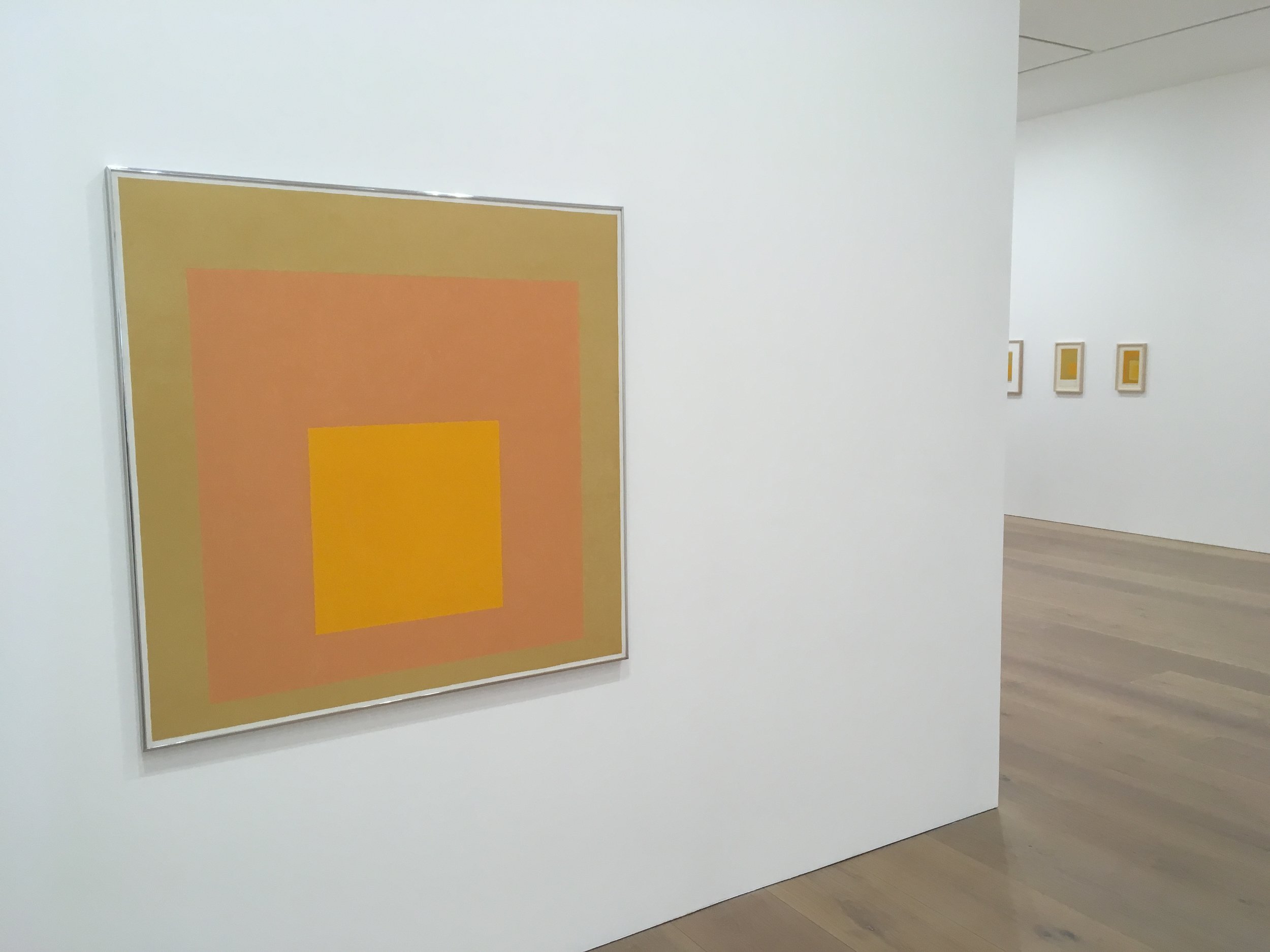
David Zwirner gallery is, at the moment, exhibiting a series of paintings by German-born American abstract artist Josef Albers. The works presented here, which span five decades (1950-1976), are part of Albers’ famous Homage to the Square paintings and are curated around the colour yellow. The theme of the exhibition, titled Sunny Side Up, stems from the artist’s interest in Goethe’s Theory of Colour (1810), in which the German poet wrote:

‘a strong yellow on lustrous silk…has a magnificent and noble effect. we also experience a very warm and cozy impression with yellow. Thus, in painting, too, it belongs among the luminous and active colours…the eyes is gladdened, the heart expands, the feelings are cheered, an immediate warmth seems to waft toward us’.  (Johann Wolfgang Goethe, Goethe The Collected Works Volume 12, Scientific Studies, ed. and trans. Douglas E. Miller (Princeton: Princeton University Press, 1995), p. 279.)

Josef Albers' exhibition Sunny Side Up at David Zwirner, a gallery view.

Josef Albers' exhibition Sunny Side Up at David Zwirner, a gallery view.

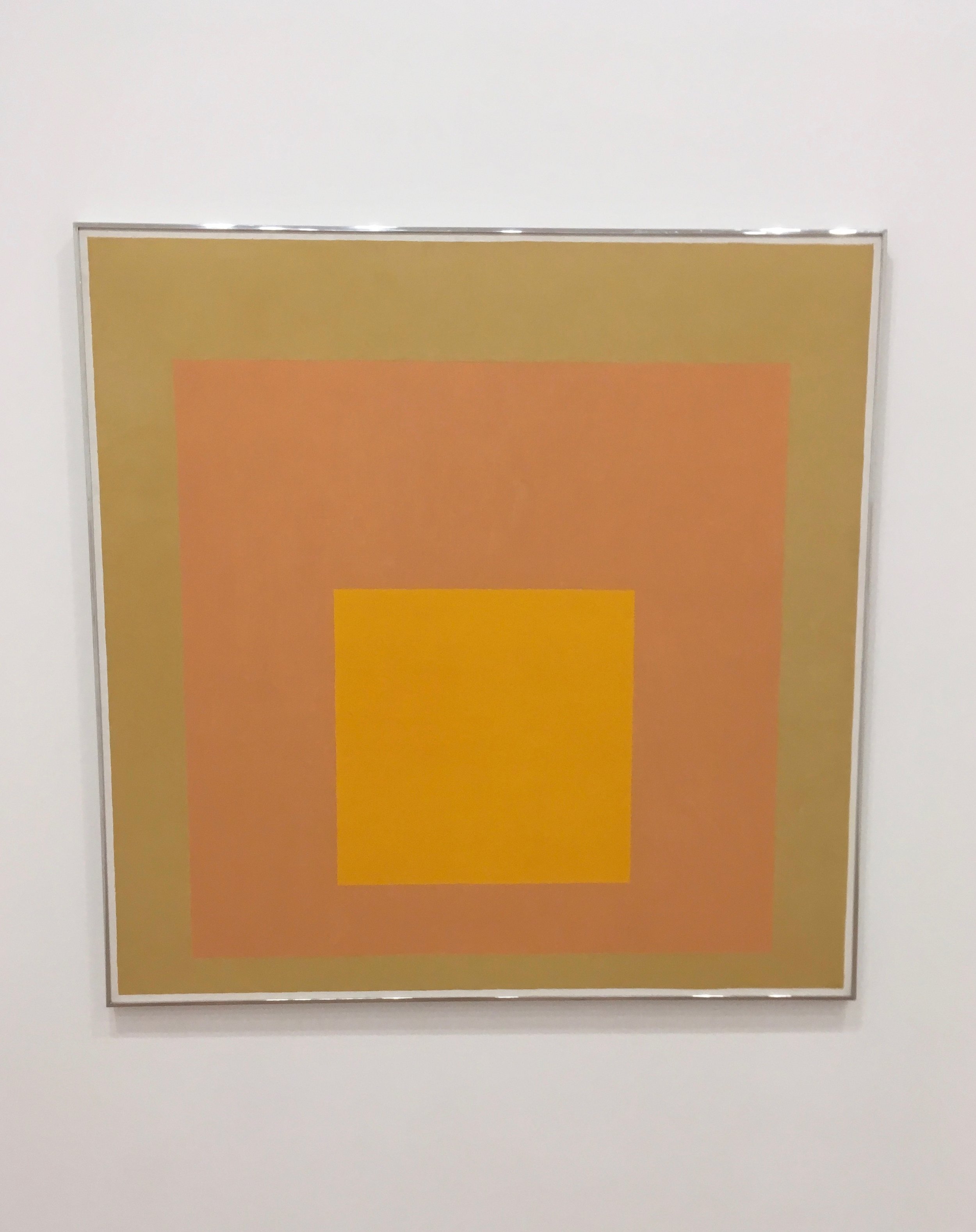
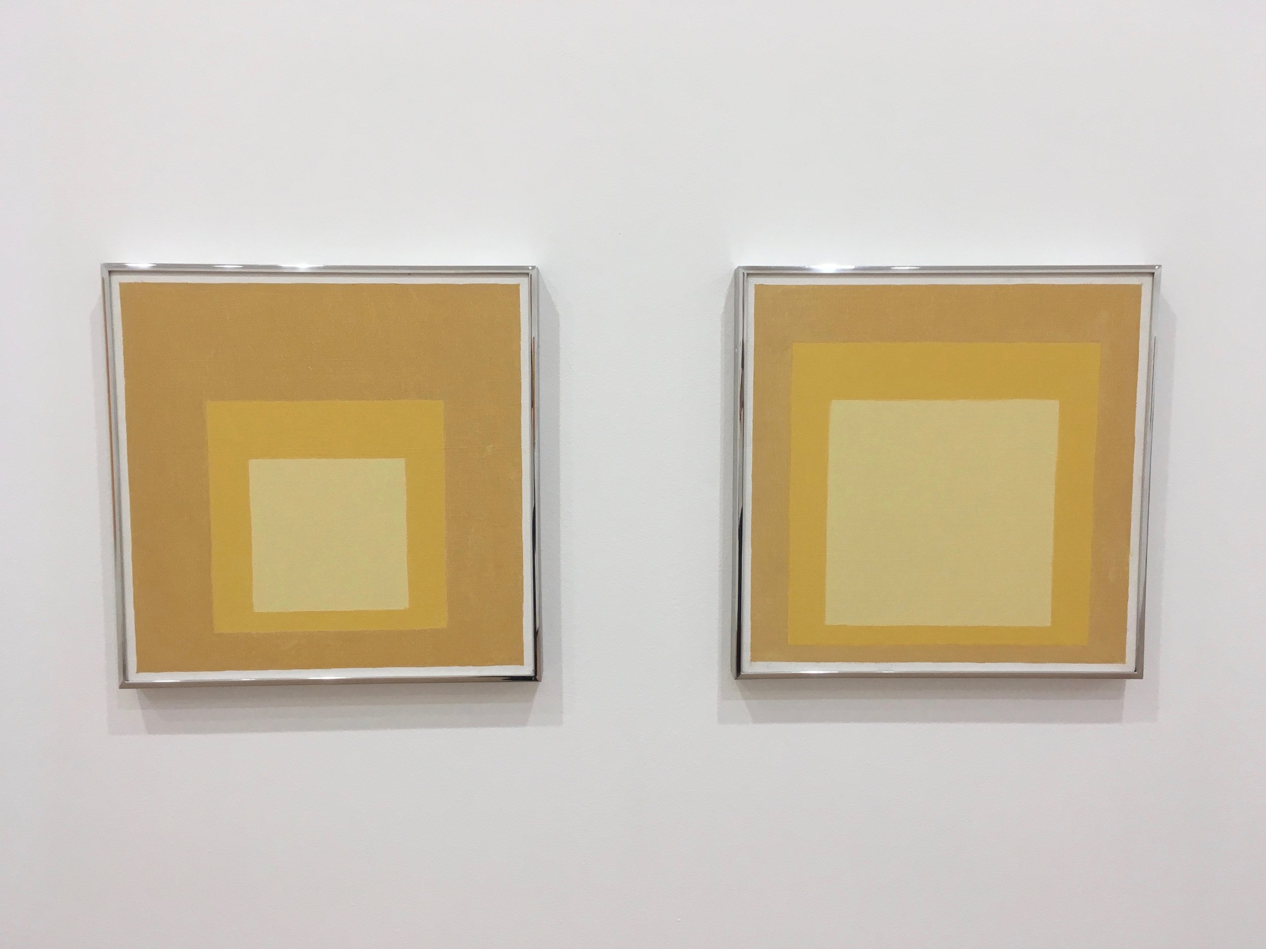
Yet, Goethe’s influential theorisation of colours does not just examine them as given artefacts but as ideas that question perception. The paintings, displayed on the ground floor of the gallery on Grafton street, seem to precisely explore this question: how colour can be perceived, challenged and defined in visual terms? Here, the exhibition gives an illustration of the rigorous and systematic approach that Albers describes in his 1963 book Interaction with Colour. As part of his focused study on the essence of colour, the artist relies on three of four colour squares nested within each other as a way of examining the optical effects that this composition creates. (The legacy of this method can be seen in the work of British video artist Simon Payne New Ratio, 2007). The result is a series of immersive chromatic experiments where the boundaries between the different squares seem to vanish. With his systematic approach, Albers is drawing the viewer’s attention to the dynamic relationship between different hues of yellows. For instance, one is led to re-consider the qualities of a saffron yellow when it is juxtaposed with Naples yellow.
To me, by exploring the possibilities of one colour, Josef Albers seems to also point at the limitations of verbal language and opens up a dialogue between the concept of yellow, with all its cultural meanings, and its endless pictorial expressions. Alongside this dialogue between verbal and pictorial, there also lies another conversation between pigments and light. Indeed, what is remarkable in Albers’ work, is its ability to translate the transparency and brightness of light into opaque pigments.

This multidimensional nature of the concept of colour reminded me of the parallel that philosopher Gilles Deleuze draws between colour and the philosophical concept. In his 1988-1989 Abécédaire, the French philosopher talks about the time it took for Van Gogh (who is famous for being a great colourist, especially with yellows) to approach colour. Deleuze reads in Van Gogh’s early career earthy tones, a respect, a fear and even a panic for colour. For Deleuze, it signifies that the painter doesn’t think of himself as being ready for approaching colour. Interestingly, Josef Albers started his Homage of the Square paintings in 1950, aged 63. With both his body of work and his theoretical writings, Albers seems to somehow anticipates what Deleuze later called philosophical colour. I also see in Sunny Side Up, the beginning of a response to the problem outlined by Goethe in 1810.

Josef Albers' exhibition Sunny Side Up at David Zwirner, a gallery view.

Josef Albers' exhibition Sunny Side Up at David Zwirner, a gallery view.

Josef Albers' exhibition Sunny Side Up at David Zwirner, a gallery view.

Josef Albers' exhibition Sunny Side Up at David Zwirner, a gallery view.

Coloured Passageways

I’m always intrigued by the gulf that can exist between a piece of work and its various online truncated representations; as such, the abundance of images depicting Do Ho Suh’s Passage/s on social media, convinced me to see the show for myself at the Victoria Miro gallery this weekend.

Installation view, Do Ho Suh Passage/s

Installation view, Do Ho Suh Passage/s

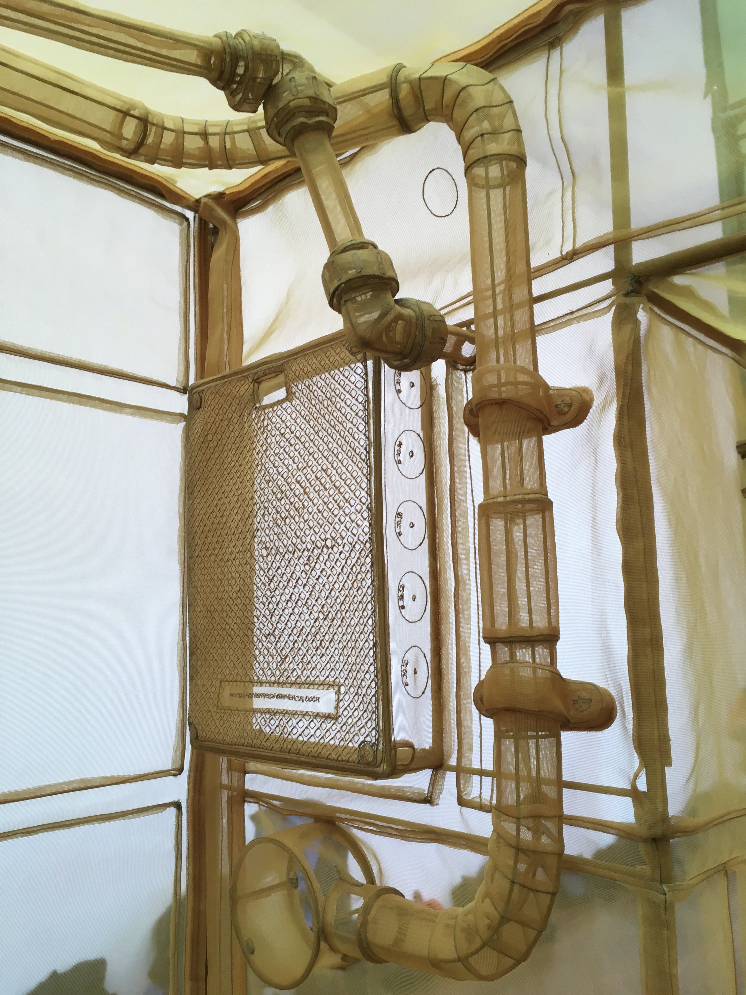
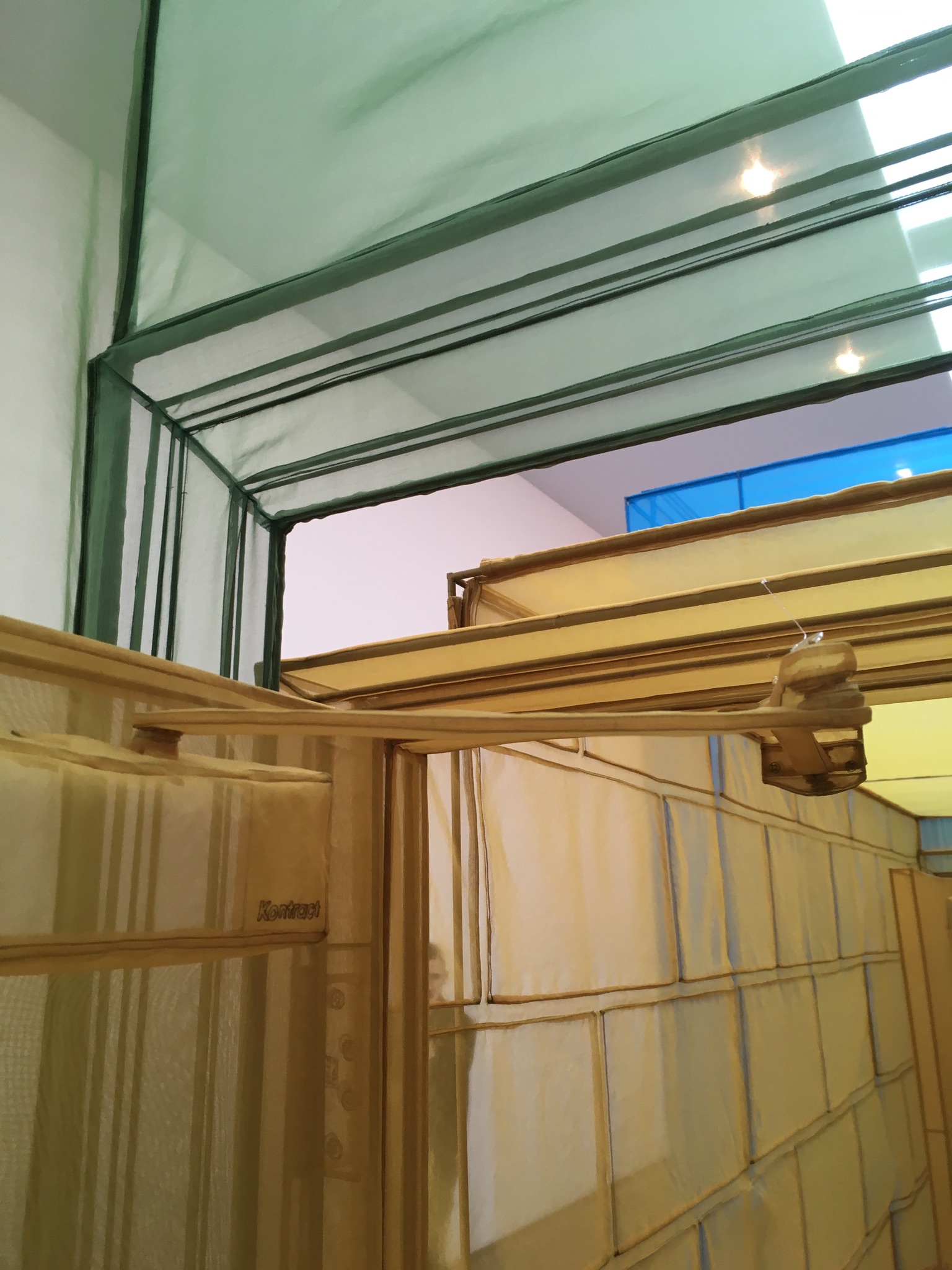
As I entered Gallery II, I understood why the images I saw online were mainly corners, edges, angles and interstices of translucent colours. The scale of the installation, comprised of nine structures, displayed in a 25 meters long gallery, requires to be experienced in situ. The work, developed in 2015, oscillates between architecture and sculpture by inviting the viewer to walk through a series of rooms mades of polyester fabric mounted on stainless steel structures. One of the underlying ambitions of the project is to shed a light on passageways and to reflect on the nature and significance of in-between spaces, rather than focusing on destinations. The spaces recreated here are inspired by rooms that the South Korean artist lived in, thus creating an imaginary and ubiquitous environment only composed of vestibules, corridors and hallways. The installation is at the same time remarkably detailed and ethereal. Components such as hinges, screws, locks, pipes are translated into transparent fabric. The colourful polyester fabric walls not only suggest an evanescent setting but they also convey a sense of domesticity which resonates with the evocation of the home that Do Ho Suh proposes. Walking through this multicoloured corridor is a destabilising concept, for being in this sequence of in-between spaces can lead to a sense of simultenous loss and wonder. Here, passages are not only thought of as transition spaces but as state of being which ask how can a multicultural and peripatetic identity can be defined? Somehow, by its delicate materiality and its introspective exploration of home, Passage/s offers an interesting inverted response to the work of Rachel Whiteread. Where Whiteread's concrete works explore ideas of collective identity and public spaces, here Do Ho Suh's installation can be read as a form of self-portrait where each architectural component becomes an attribute of the artist’s portrait and as such symbolically points at a feature of a space once lived. The colour variations take part in this self-exploration by suggesting to the viewer different psychological states.

As part of the exhibition, So Do Suh also exhibits a set of new works resulting from a new process developed during his residency at STPI Singapore. In this new method, the artist’s architectural pieces are compressed into 2D large dimensional ‘drawings’, where the gelatin tissue used to build a 3D room, is fused with paper by immersion in water.
Once in water, the gelatin tissue disappears, and reveals - on paper -the stiching which used to construct the architectural piece and which is now an abstract form of drawing. It strikes me that the press release describes the 2D pieces as drawings, for it is the impression I had whilst walking through the 3D installation. The stitches, made apparent by the choice of transparent polyester fabric, are not solely structural elements, but also take on an aesthetic quality. They sketch the boundaries of the space within which the installation is set up, and leave me with the impression of being in a drawing. To me, the 2D pieces provide an essential complimentary reading to the 3D exhibits. Just as much as Passage/s installation opens up a space to rethink in-betweeness, by deconstructing some of his 3D pieces into compressed abstractions,  Do Ho Suh his opens up a space where one can witness the passages of his own process.

Installation view, Do Ho Suh Passage/s

Installation view, Do Ho Suh Passage/s

Installation view, Do Ho Suh Passage/s

Installation view, Do Ho Suh Passage/s

Installation view, Do Ho Suh Passage/s

Installation view, Do Ho Suh Passage/s

Installation view, Do Ho Suh Passage/s

Installation view, Do Ho Suh Passage/s

Installation view, Do Ho Suh Passage/s

Installation view, Do Ho Suh Passage/s

Installation view, Do Ho Suh Passage/s

Installation view, Do Ho Suh Passage/s